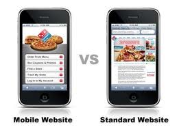
 Many people are using their mobile phones to access internet and to find information which they want, from any part of the world. More and more mobile users are browsing and searching internet on their handsets. Many mobile users in UK use mobile internet to get the information on every move. The web browser providers, provide service that is not enough for the users. If you are designing your websites for viewing through mobile internet, you need to check how your sites will look and work on mobiles. Many mobile users are expecting higher standards of browsing when they are browsing on their handsets.
There are few tips for the website providers to improve your mobile user experience.
- Reduce the content text size: Reduce the content size which appears on the mobile web page. Showing full content in the PC web search is good, but in mobile it is quite difficult to see entire content. So it is important to reduce the amount of content shown on the mobile optimized version.
- Single column layouts works best: Web pages are difficult to view on small mobile phones. The web pages load with zoomed out, it is difficult for the user always to zoom in and see. In some mobiles, it is not easy to set zoom many a times. So, provide the web page in a single column layout remove low priority content and make it in a single layout.
- Present the navigation differently and do not repeat the navigation on every page.
- Clearly distinguish the selected items.
- Make user input as simple as possible.
- Only show essential information.
- Place basic browsing controls on web page.
- Take the advantages of inbuilt functionality.
- Optimize the bandwidth.
With the help of above tips one can improve the viewing of websites in mobiles thereby enhancing the mobile Internet usability.
